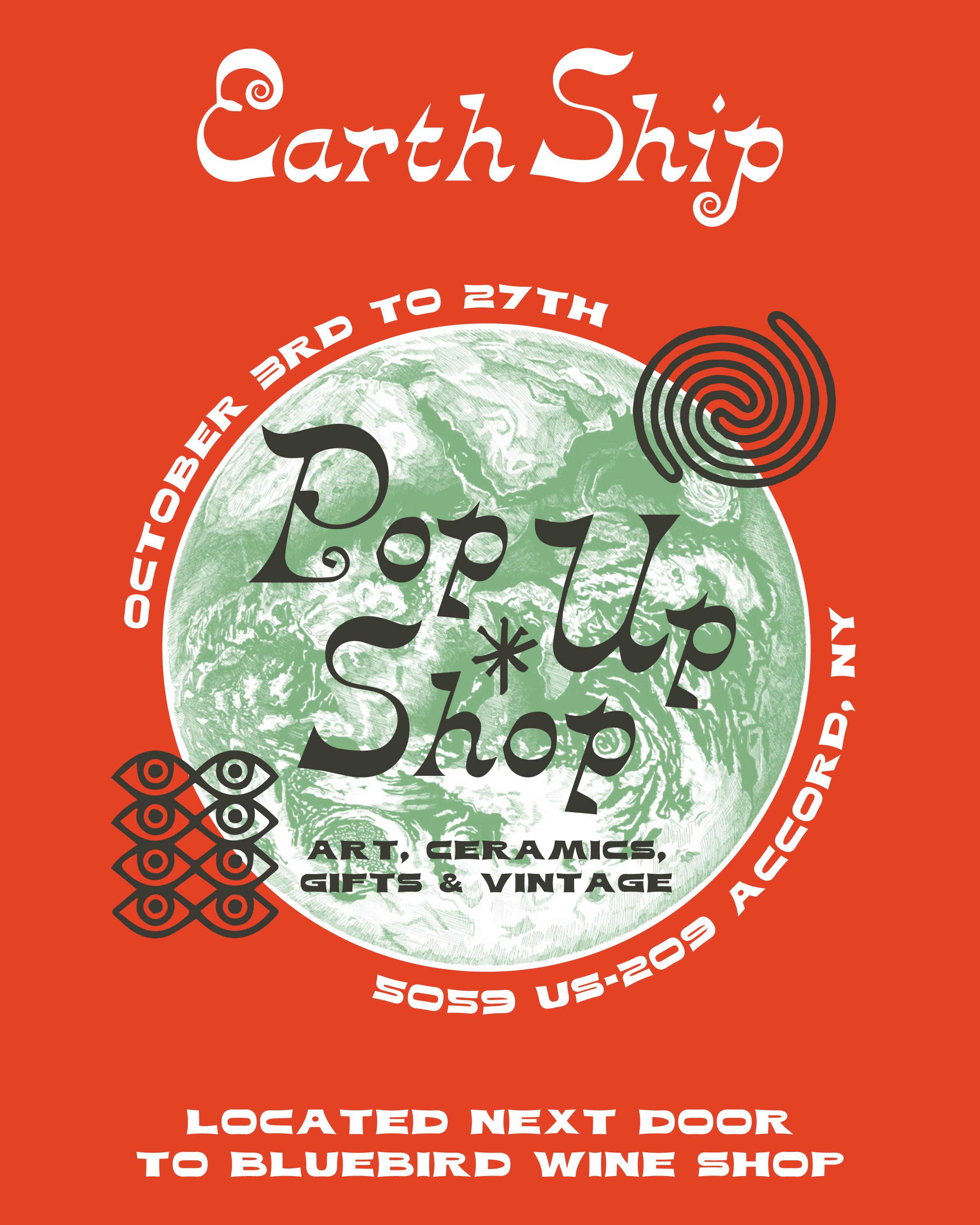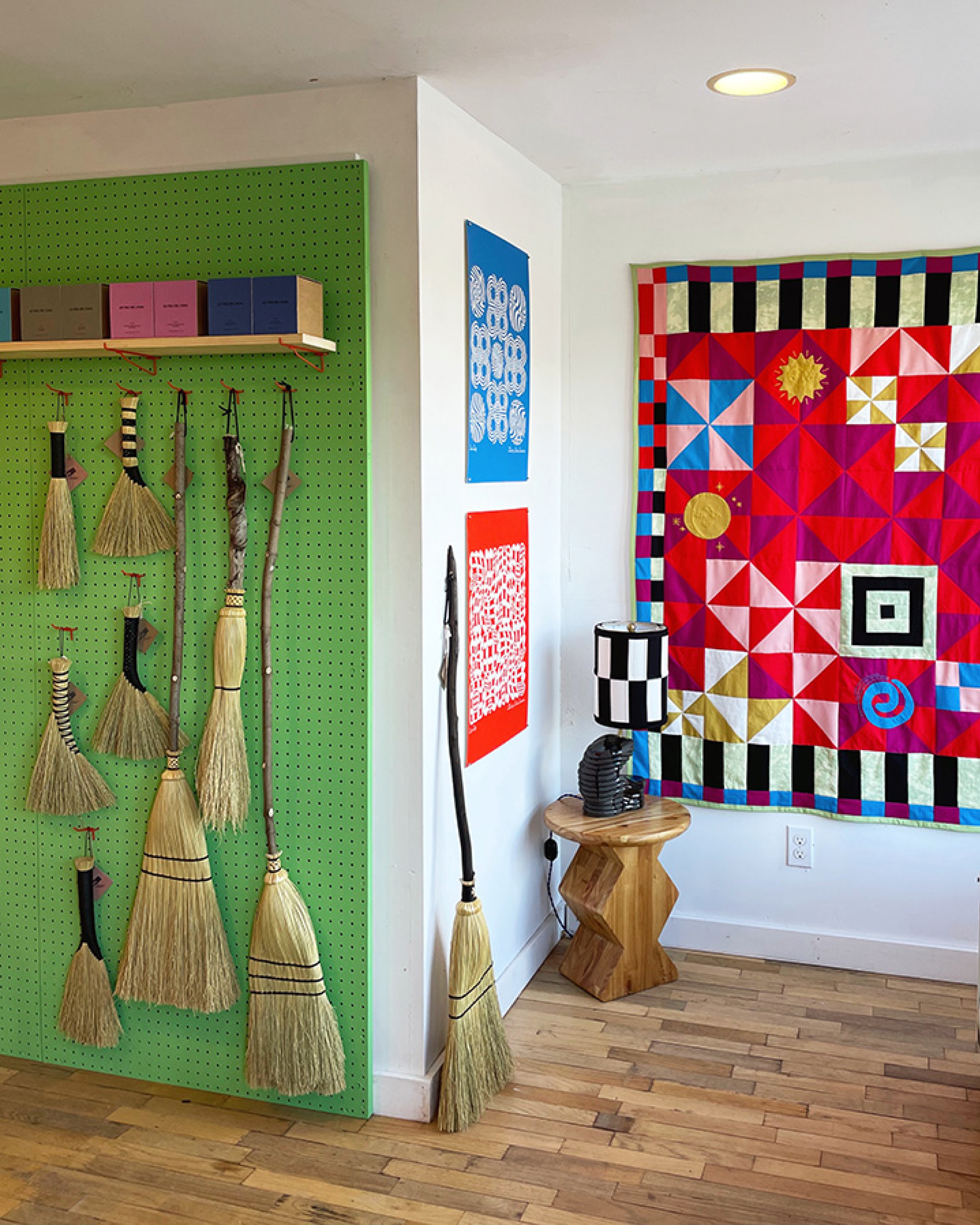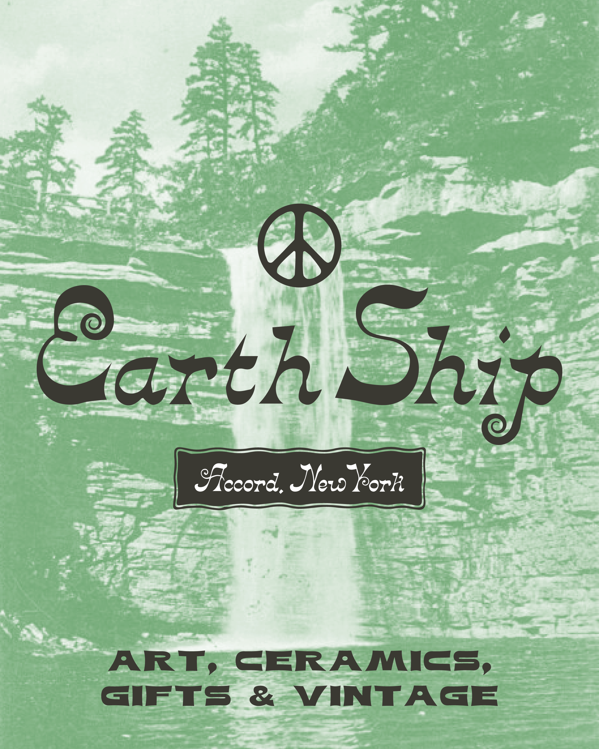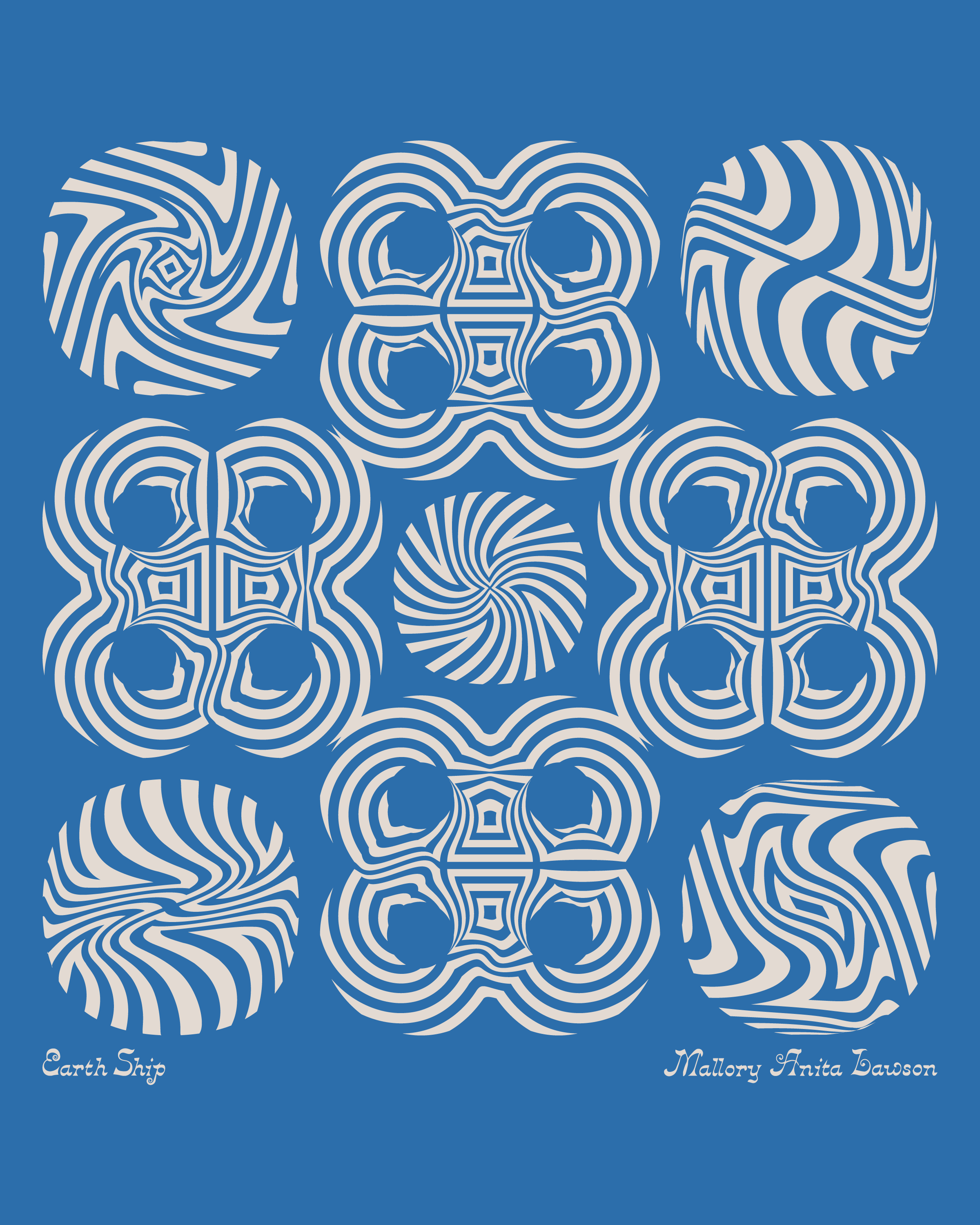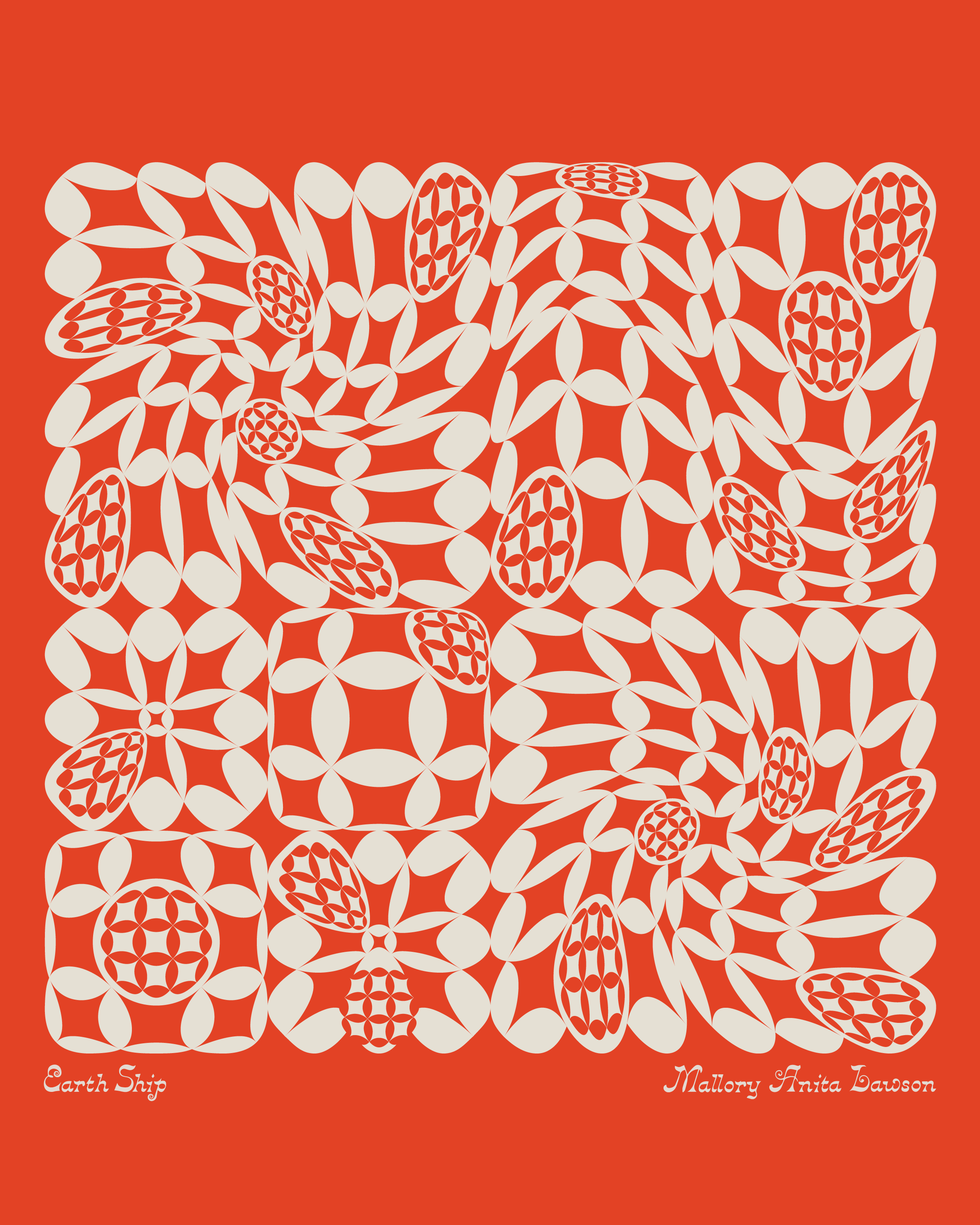
Earth Ship developed the art direction and branding for its first pop-up store, creating a cohesive visual identity that extended across the space and its printed matter. The work included a custom lettermark, typography system, and color palette, designed to feel graphic, grounded, and distinctly Earth Ship. The identity was applied to a series of limited-edition screenprints, bumper stickers, tote bags, and buttons, blurring the line between brand ephemera and collectible objects. The pop-up featured work by friends and collaborators and served as a space for gathering, events, and shared creative exchange.
