The Business of Naming
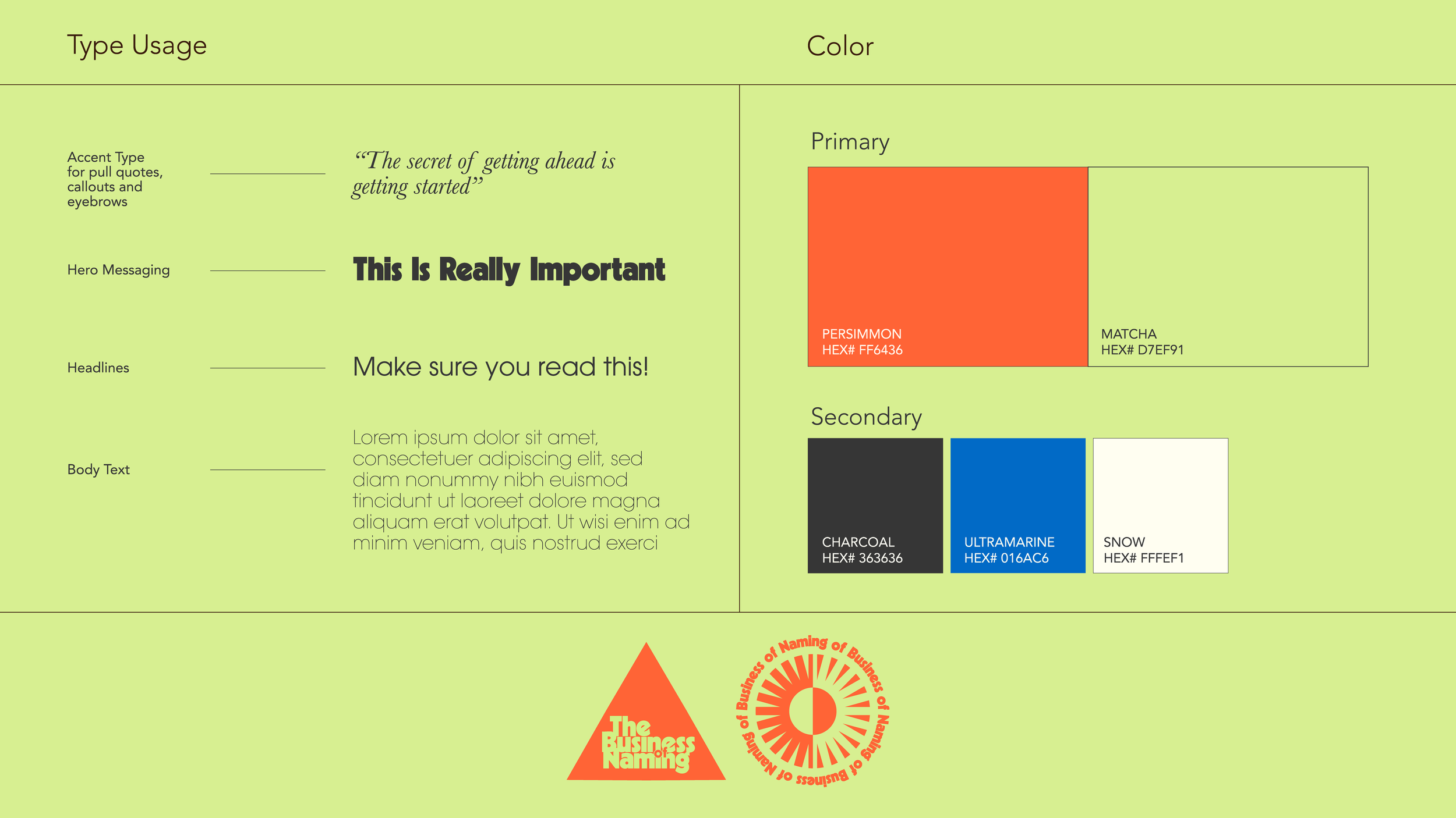
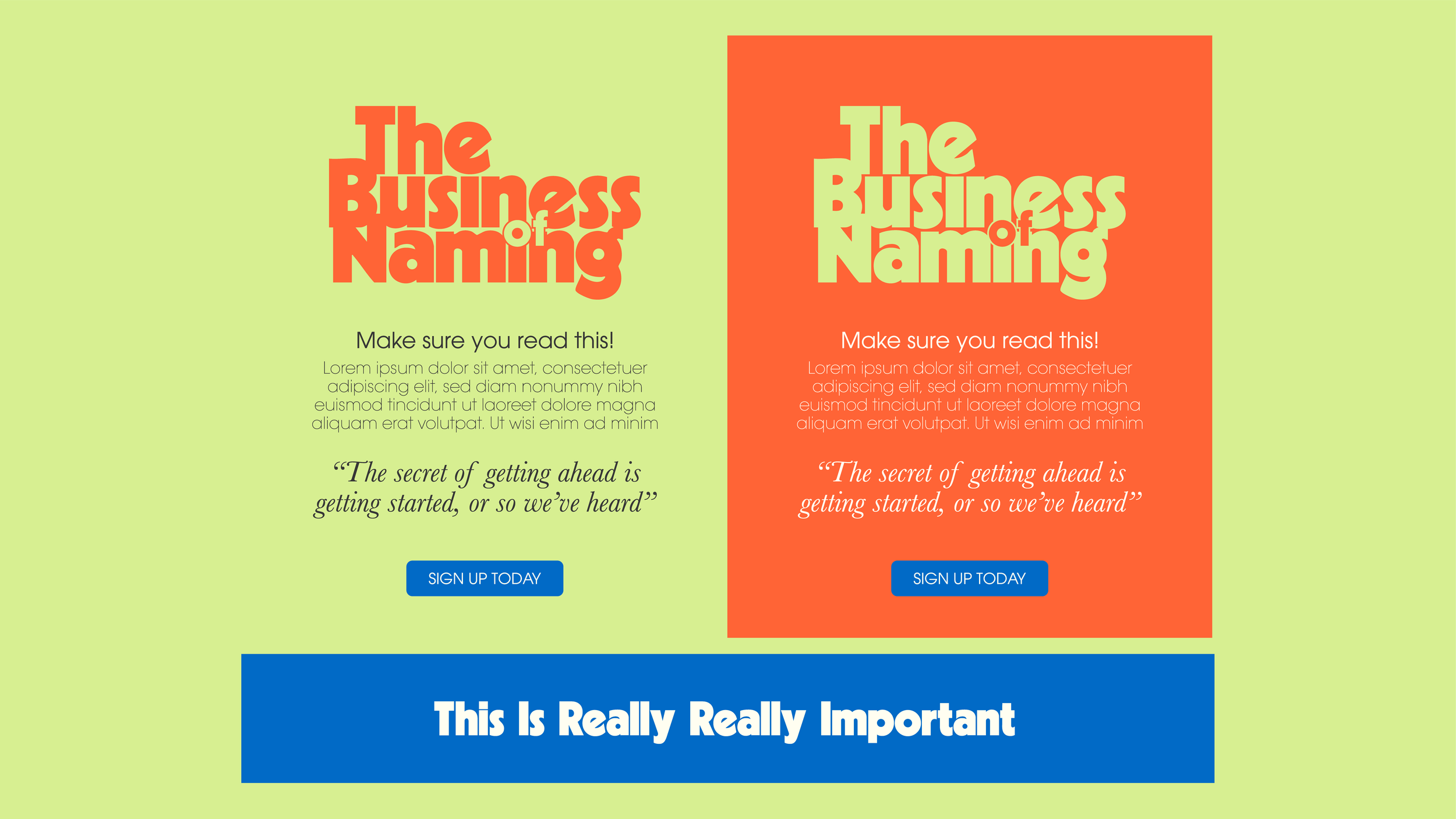
Earth Ship developed the visual identity for The Business of Naming. The work included a custom lettermark and icon, a distinctive typography system, and a bold, high-contrast color palette designed to feel contemporary, intelligent, and memorable. The identity was built to scale across digital and physical touchpoints—from promotional materials to on-site graphics—creating a cohesive visual framework that supported the conference’s ideas, speakers, and conversations.